
Re-imagining a Classic
- Emmy Lawless
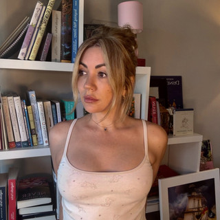
- Aug 8, 2025
- 2 min read
There’s a kind of magic in revisiting the stories that shaped us.
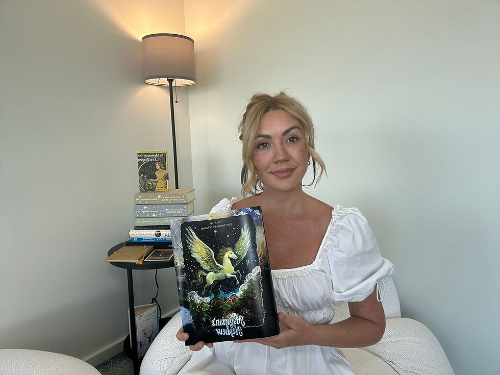
As an artist and book cover illustrator, few tales have left as deep an imprint on me as The Magician’s Nephew by C.S. Lewis.
I feel like ever since reading this series as a child, I’ve carried the visual world of Narnia in my heart - the woods, the portals, that stillness before creation.
This cover wasn’t a commission (I wish?! If any publishers are thinking of doing a Narnia run.. Here if you need). It was a passion project that began with my friend Amanda showing me her (kind of creepy) edition and said she would love a version painted by me.


The Creative Spark
There are so many incredible visual pictures I could draw from in this book. Edwardian London, the historic royalty scenes, Narnia coming to life, the garden of Eden nod etc but as a non-ashamed Horse girl, my favourite character was always Fledge - the horse who goes from pulling a cab on London streets to being a flying horse in Narnia. I also wanted to feature the silver apples so I chose to create that for the back. Then of course I could not miss the Wood Between the Worlds so that became the endpaper.
Building the Scene
I started with a thumbnail sketch as always, everything starts with pencil on paper. Then I added detail in pen and played around with a few different compositions for the front and back.

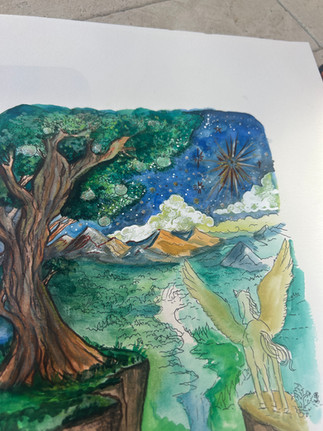


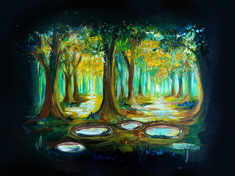
For the Wood Between the Worlds I wanted it to feel like it was sort of suspended in time - eerie and quiet. I used acrylic paint to build up layers, and added highlights in shimmery paint pens then brought in digital tools to sharpen details and adjust light. This blend of mediums let me create the dreamlike quality I was aiming for.
Choosing the Color Story
I leaned into an earthy, jewel-toned palette. Mossy greens for the wood. Warm light spilling from the pools. A touch of twilight (not the vampires, the time of day) The world of The Magician’s Nephew is full of contrasts—creation and destruction, innocence and power—and I wanted the color story to hold all of that so I wanted it to feel quite dramatic.
Why This Book?
Aside from wanting to do something pretty for my friend Amanda. So often, cover design is about marketing… what will make someone pluck something off a shelf or press an amazon link. This was different. This was love. I wanted to interpret it through my own lens—through the kind of art I got to experience growing up that helped spark my imagination and get excited about a story. My goal was to create something that felt as rich and layered as the story itself.


Final Thoughts
I think any sort of re-imagination (particularly when some of the OG editions were by an icon like Pauline Baynes) is a delicate balance between reverence and reinvention.
I always want to honor the source but also enjoy getting to add my individual voice to it.
I have filmed this process in action on TikTok here or Instagram here.
If you’re looking for a custom dust jacket for an old favourite, you can reach me here
All my love xxx
Emmy


